Boston Hospital Mobile Portal Redesign
The hospital we collaborated with on this project faced a significant influx of inquiries, which resulted in an increased workload for the customer services team. To tackle this issue, I worked alongside two other designers to redesign the Login, Home, and FAQ pages within the given constraints. Our redesign focused on restructuring the information architecture and creating wireframes to improve the platform's usability. To ensure the efficacy of our design, we conducted usability tests and interviewed stakeholders, which helped us validate the redesign. As a result, the mobile portal became more intuitive, and users experienced less confusion when navigating it.
Time: 3 months
My Role: UX researcher and designer
Methods: Site map, Usability test, Wireframing, Prototyping
Tools: Figma and Maze
Challenges
The hospital provides patients with a digital platform for managing their health records, visits, bills, and communication with the care team. However, the platform's support team received an overwhelming number of support tickets from users, indicating confusion among users and creating extra work for the support team. Additionally, the team discovered that over 60% of users accessed the portal from mobile devices, making the mobile portal the primary focus of the project.
Through analyzing a large number of support tickets and the information architecture, we found that the platform faced several challenges:
The current instructions failed to guide users to find their needs through the portal effectively.
The navigation design was confusing for the users when they were looking for support.
The design and the content of the portal weren’t consistent since the portal was owned by three different units.
Goals
Figure out how we might restructure information within the mobile portal so that users can easily find what they need.
Redesign the Login, Home page, and FAQ webpage.
My role
During this project, I worked with the other two team members. We shared the whole research and design process. My contribution included:
Restructure information architecture
Ideation
Wireframing-Login process
Prototyping-Login process
Usability testing
Presentation
Solutions
After intensive research, we proposed a user-centered design mobile portal.
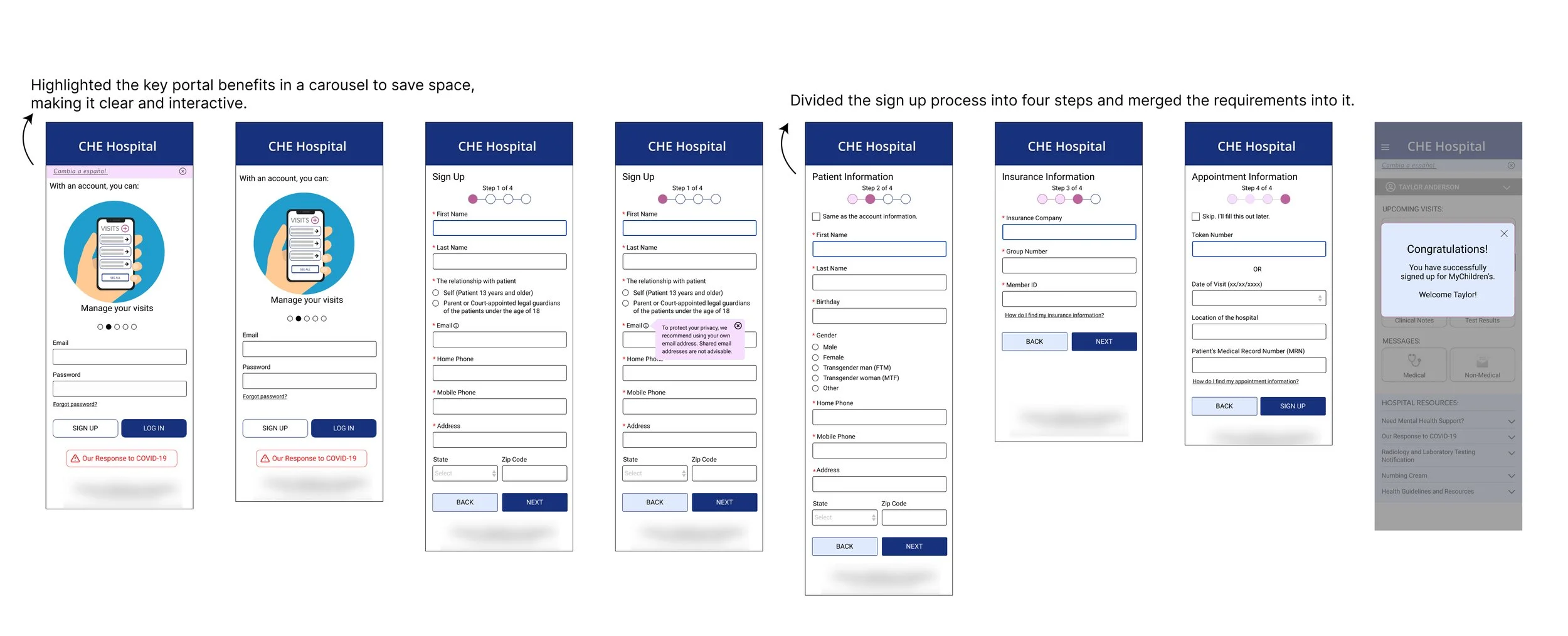
Log-in
Current problems: Information such as the key benefits of the portal, who can have an account, technical requirements, and how to sign up aren’t displayed clearly to the users.
Solution:
Home page
Current problems: Information such as the key benefits of the portal, who can have an account, technical requirements, and how to sign up aren’t displayed clearly to the users.
Solution:
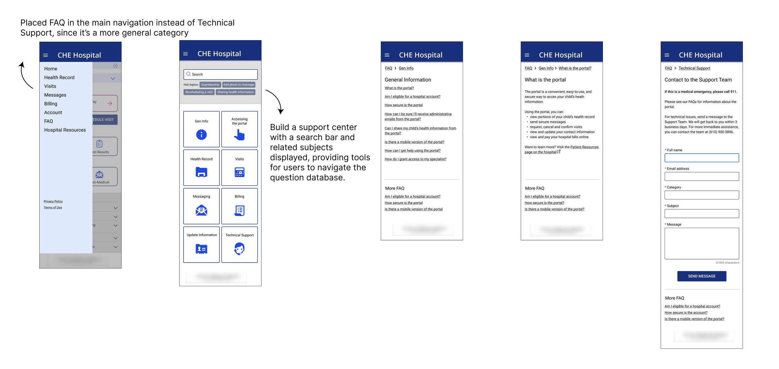
FAQ
Current problems: FAQ was under the Technical Support page, which made it difficult for users to find support when they have questions.
Solution:
The Design Process
Site map
The site map helped us understand the breakdown of the site, and also identify improvements to the information architecture.
Usability testing & stakeholder meetings
After the initial research, my team created the first version. We conducted the usability tests on over 20 participants and held stakeholder meetings to integrate the design process and design validation.
These are the overall findings:
Users tend to skim or avoid reading
Iconography is an effective way to guide users
Large images can affect load time
In-line notifications can cause confusion and distraction
These findings served as the design principles and guided me when building out the user flows.
Iterations
Take the log-in user flow for example, we redesigned the log-in process based on the results from research.
Result
We proposed changes to the navigation and reduced verbose language with titles, sections, and iconography. The proposal decreased the users’ cognitive loading in the using process and relieved the support team’s workload. The presentation received great feedback from the sponsor. They specifically praised how the sign-up process was improved by decreasing the cognitive loading.
"It indeed helps us shorten the sign-up process and solve the current confusion.” - Sponsor
Takeaway
Throughout my experience working on the design principles and communication section of a hospital portal, I have developed a deep understanding of how to strategically approach design while working with tight restrictions. Collaborating closely with the hospital's support team has taught me how to balance user needs with business goals, which is critical when designing effective healthcare systems. By leveraging my skills in human-centered design, I was able to create a portal that was intuitive, user-friendly, and scalable.
While I am proud of the final version of the design, I believe there is always room for improvement. In particular, I would have loved to have more time to conduct further testing with real users to ensure that the portal meets their needs and expectations. Specifically, I would have liked to test the design with parents and children over the age of 13 to validate its effectiveness. This type of testing would have allowed me to gather more meaningful feedback and insights into how users interact with the system.
Another area I would have liked to explore further is designing for parents with multiple children. Given the time constraints, this was not something I was able to fully consider during the design process. However, I believe that it is an important aspect to consider since many parents have multiple children with different healthcare needs. By exploring this context further, I believe that I could create a more comprehensive and inclusive design that would meet the needs of a wider range of users.
Overall, my experience working on the hospital portal has taught me valuable skills in strategic thinking and designing with restrictions. Moving forward, I am excited to apply these skills to new challenges and continue to improve my ability to create effective and impactful designs.


